Covid-19 Overview - Data Exploration in SQL and Power BI
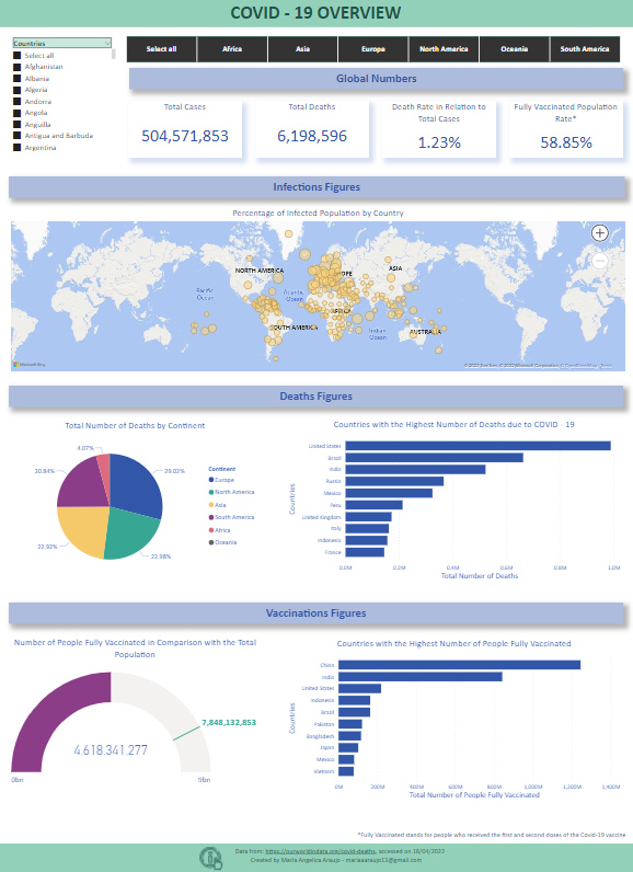
This interactive dashboard brings global information about Covid-19 all around the world, such as the global figures and infections, deaths, and vaccinations numbers.
Skills: SQL, SQL Server, Power Query, Power BI
Objective: This was my first project and its main goal was to get my hands dirty, practicing in a structured project all the concepts and topics I had studied so far in SQL and Power BI. I wanted to answer the following questions:
What are the global numbers about Covid-19? Show the total number of cases, the total number of deaths, the death percentage in relation to the total number of cases and the percentage of the population who were fully vaccinated;
In a map graph, show the percentage of infected population per country;
About death figures: in a pie chart, show the total number of deaths per continent. In a stacked bar chart, show the top 10 countries with the highest number of deaths due to Covid-19;
About vaccinations figures: using a Gauge graph, show the number of people fully vaccinated in comparison with the total population. In a stacked bar chart show the top 10 countries with the highest number of people fully vaccinated.
All the information in the visuals should be filtered by continent and country.
Data source: The dataset was extracted from https://ourworldindata.org/covid-deaths and accessed on 18/04/2022. It shows information about deaths and vaccinations of Covid-19 from the beginning of the pandemic until 17/04/2022.
Development of the project: First, I used SQL to create three views with the relevant information regarding Covid deaths, vaccinations, and the location of the pandemic. After that, I imported these views into the Power BI Desktop (PBI). I decided to do this in SQL, as the closer to the source the data manipulations are done, the lower the load on report/dashboard load/update time.
The ETL process was done via Power Query with the aim to build the PBI data model upon which the visualizations were built. Below follows some tasks that were made in this process:
Replacing “null” values to the value “0” in numerical columns, since it will be necessary for future calculations;
Changing data types to the correct ones in each column;
Removing unnecessary columns to improve performance.
After that, the tables were loaded into PBI and the data model was created using star schema with two fact tables containing the deaths and vaccinations data respectively, and two dimension tables, one representing the dates (with a date hierarchy) and the other one with the locations. Although the date table was not used to create the dashboard itself, I decided to create this table not only with the objective of practicing this essential skill but also for future convenience, allowing me to answer questions and gain insights related with time.
Once the data was clean and the model created, I made use of calculated columns in order to get the correct values about the Covid deaths and vaccinations. It was necessary because these values were cumulative, then, only the values of the last day of each country were needed.
With these correct values, I created measures to be used in the visual, and then I was able to create the visual with the main points about Covid-19, answering the questions presented above.
After the dashboard was finished, I went back to SQL and wrote queries seeking to answer the same questions in order to compare the results obtained in PBI, which also served the purpose of developing further my SQL skills.
You can access both, the .pbix and .sql files here: https://github.com/ds-mariaraujo/CovidPortfolioProject.git
Below, you can see a preview of the Covid-19 Overview dashboard:


